Projects » Web Graphic Design
Logo design for Tetractys Technologies company
Tetractys Technologies
-
 Tetractys Technologies - Logo design by Webart
 -
 The brand symbol of the company
 -
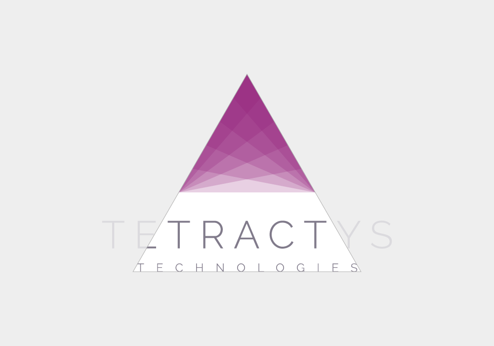 The word Technologies is an imaginary extension of the triangle
 -
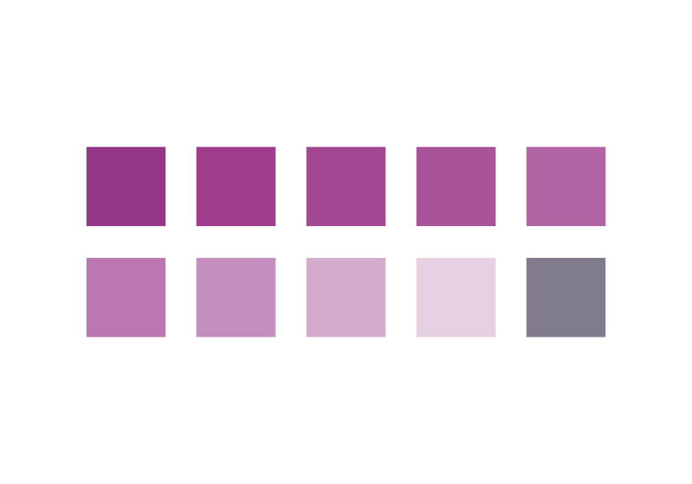 The color palette of the logo
 -
 The logo on a dark background
 -
 The logo in black and white color (GrayScale)
 -
 The logo in horizontal layout
 -
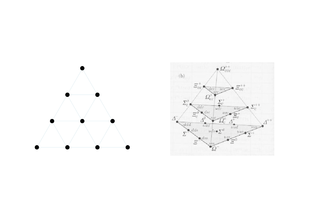 Display of the tetractys shape
The company
Tetractys Technologies deals with the development of technology for tourism businesses. Its main product is a one stop shop for all travel products with travel planning technology for travel package design. For this reason, the client wanted through the logo to display characteristics appropriate to a high-tech company (Minimal & HighTech).
The inspiration
Our inspiration was the name of the business. Tetractys is a sacred symbol of the Pythagoreans. The shape of tetractys is made up of the first ten digits (1-10). These numbers are placed in four rows as follows: one in the first row, two in the second, three in the third and four in the last row. The shape is of great interest, but it had to be decomposed to show the minimal character of the business.
The color
The customer's request was to use the purple as the basic color of the composition. For this reason, it was placed in the trademark. Diagonal slides form purplish gradations. The gradients begin with more intense purple color at the top and end up with a softer shade at the bottom. So the shape gives the feeling of being hovering. The word "Tetractys Technologies" is depicted in a gray tint to be read easily, but also to emphasize the shape even more.
The shape
The font used is minimal and easy to read, even in small dimensions. The diagonal slides of the signal are highly dynamic and aim to symbolize the company's innovative practices. Finally, if we extend the two diagonal sides of the triangle, we notice that the word "Tetractys" is enclosed in an imaginary triangle.
Relative Projects
 OTOE - Corporate Identity
Web Graphic Design
 MacArthur Capital - Logo renewal
Web Graphic Design
 DAC - Business Consulting
Web Graphic Design
 Lampros Psarris - Carpentry
Web Graphic Design
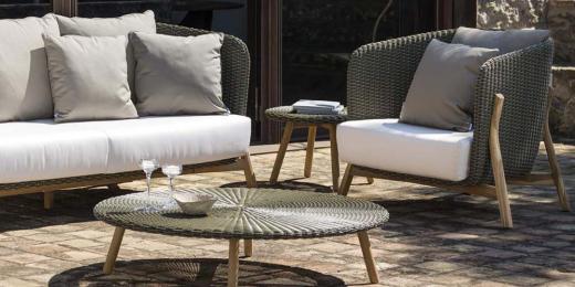 KYSO e-shop - Garden furniture
Web Development
 Yacht Charter - Logo
Web Graphic Design
