Projects » Web Development
Web design for furniture company
Casa di Voz - Furniture & Decoration
-
 Logo Casa di Voz
 -
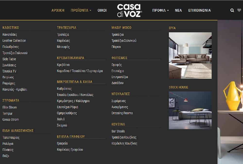 Mega memu of categorized products, as well as the company's Stock House and projects with photo display
 -
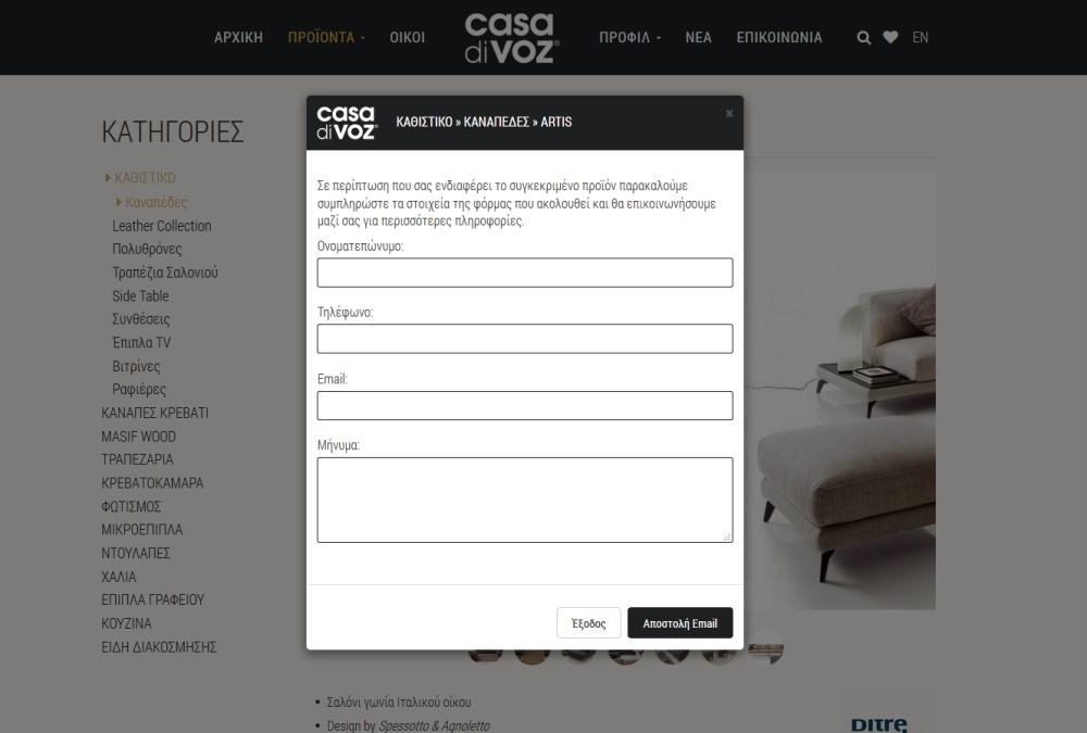 Contact form for a specific product
 -
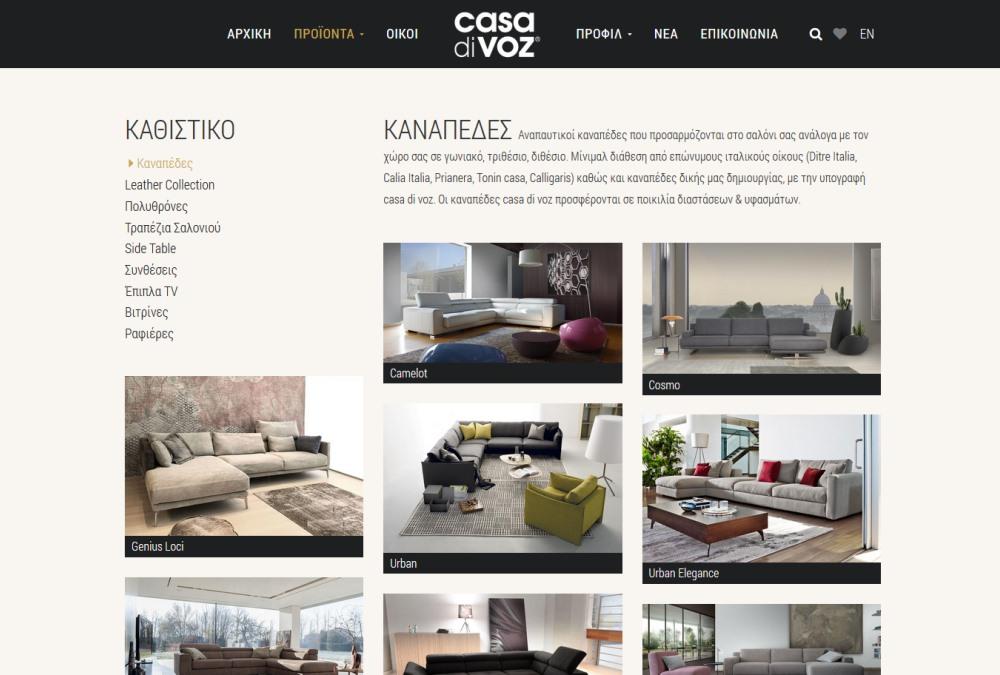 List of categorized products
 -
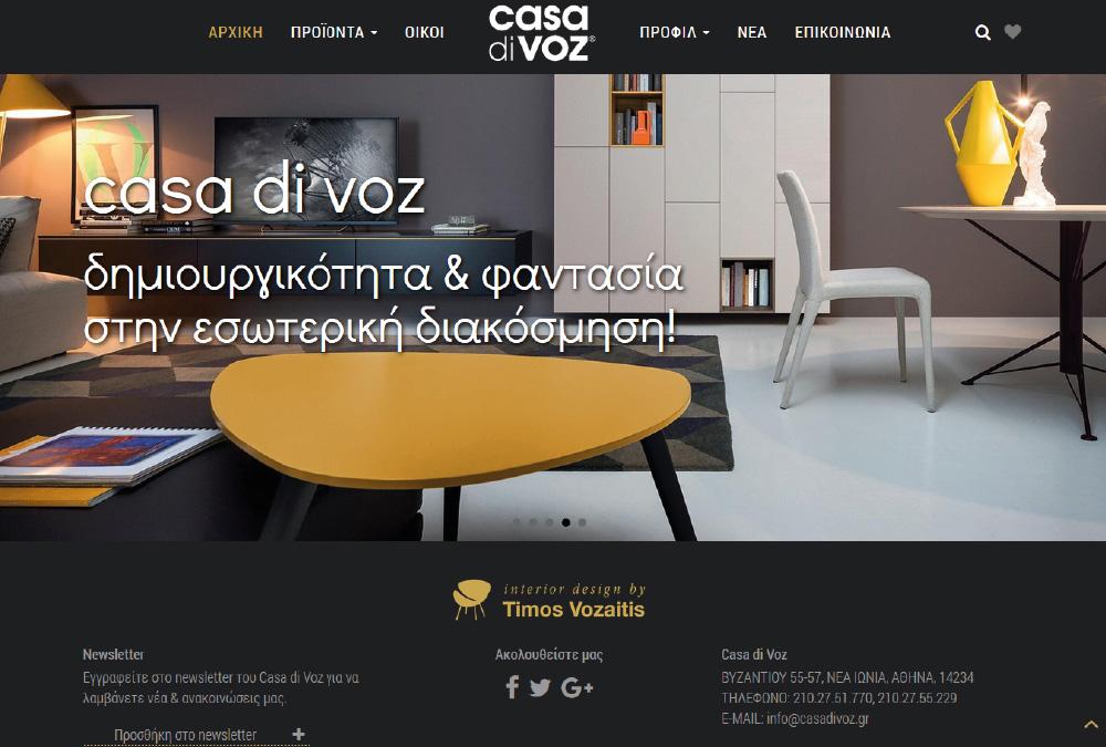 Casa di Voz home page
 -
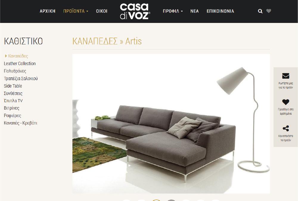 Development of the product page with the ability to send an e-mail, create a list of favorite products and share the product through Social media
Web development
The site of Casa di Voz is constructed in a way that ensures the easy navigation of visitors. For this purpose a MegaMenu was placed at the product section and side menus on each page that was considered necessary. The side menu has a list of all the categories, with the one that the user is at the moment remaining open and the subcategory in which browses being highlighted, thus making it easier to navigate. The visitor has also the ability to send e-mail requesting more information on a specific product, create a list of favorite products, share the product through Social media and see the next item in the list. At the right side of the main menu is placed an icon for searching products and also an icon to display the list of selected "favorite products". So access to the products and the final selection are made even more directly, facilitating the entire process. Finally, in the "Contact" section at the top of the map, the visitor has the opportunity to write the address of which he will start and automatically sees the route to be followed in order to reach the store.
Web graphic design
The visual design of the site was carried out with a minimalist mood. Particular emphasis was given to the photographic material and earthy tones that surround it, creating a sense of peace and comfort. The logo is positioned in the middle of the menu, thus setting it apart, conceivably, in two core units. The left regards the company's products, while the right refers to the company itself, presenting the history, the various news and the ways through which one can communicate with the operators. The alteration of photos and texts in categories and subcategories is done in slow motion to maintain the tranquility prevailing in environment of the website. All icons have simple lines in order to be compatible with the company's logo.
On page SEO
The implementation of the site was based on the SEO Standards rules.
Relative Projects
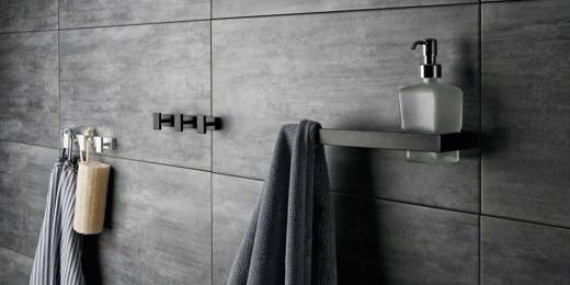 Sanco - Bathroom accessories
Web Development
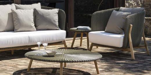 KYSO e-shop - Garden furniture
Web Development
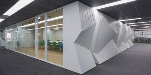 Movinord - Corporate furnishing
Web Development
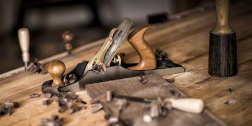 Lambros Psarris - Wood workshop
Web Development
 Dr. Petropoulos - Doctor's Website
Web Development
 RolStrat - Aluminum systems
Web Development
